Context & Problem
ProMETA was the institution where I worked as IT Support Manager. In 2020, we had a website that urgently needed a redesign, as not only did the image displayed fail to reflect the institutional objectives of the time, but it also provided users with nothing more than information, making the user experience uninteresting. Furthermore, when this site was built, viewing on devices other than computers was not taken into consideration.
My role
This project was initially assigned to the institution's marketing and technical teams. As part of the technical team, I was involved because I would be responsible for keeping the website up to date. However, as the project progressed, my role changed and I became responsible for the design and development of the site.
Challenges & Development
The biggest challenge we faced at that time was the lack of staff with web development skills, as well as a limited budget and a pressing need to redesign the site. Since my knowledge at the time was limited, we decided to keep the site on WordPress, as our previous site was on this platform. In addition to this, we decided to purchase a WordPress theme and make adjustments to customise it in line with the institution's image. To facilitate this work, we decided to choose a theme that worked well with Elementor and allowed us to customise it without needing further knowledge.
The other big challenge I faced was learning about plugins, terminology, how to keep the site secure, and how to link it to Mailchip and data analysis tools such as Google Analytics. To solve this, I had to do a lot of research, read many articles, and do a lot of trial and error on the site.
In addition to this, getting all the elements to look aligned was my second challenge, if you visit the site even today you will find that still not everything is aligned, I probably added too many margins and paddings without really understanding how they affect each other.
Results
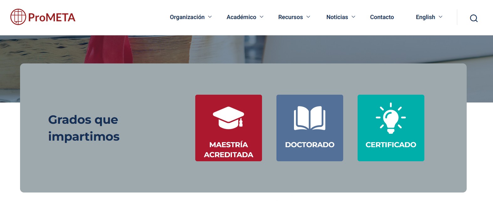
The website redesign was completed successfully and on schedule. The design includes space to highlight elements that the institution wanted to promote, such as student testimonials and events. In addition, the site now includes the option to subscribe to two MailChimp campaigns and collects data to better understand site users, elements that had not been implemented on the site previously.
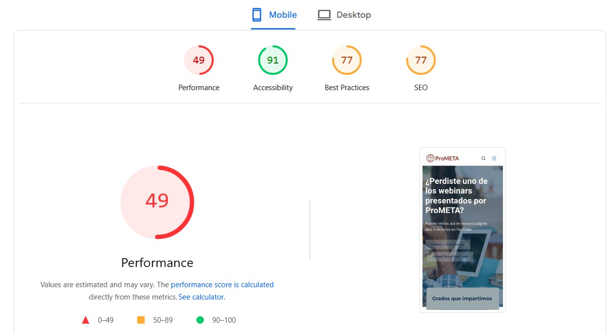
In retrospect, the biggest mistake I made was not optimizing the images; the site is extremely heavy. Probably, the number of images is too much, but additionally, they are all in JPG and full size; none of them were adapted for their function. This causes a very poor performance of the site. Here, I leave the Page Insights indicators for you to see:
With what I've learned so far about web development, I see so many points of improvement and considerations that should have been done, what make me itch to knock on the door to go back just to make all the corrections, but the reality is that it's time for a complete update and not fixes.
I am very fond of this site, many times I felt suffocated and overwhelmed for not understanding many things, but at the same time I had a lot of fun trying and making a lot of mistakes, but above all I appreciate the vote of confidence they gave me for just being tech-savy and curious. Thanks to this, I’m where I’m today.
The site is still online today if you would like to visit it pro-meta.org. To conclude, here is the version of the site before and the result.