Case study: ProMETA, my first webpage
This story begins in the days of COVID, when we are all struggling with something while locked up in our homes, where one day I received a phone call from a co-worker asking me if I would accept the challenge of creating a new website, being nothing more than a software manager who knew nothing about web development.
At this time, I was working for ProMETA, an online university in Latin America, where technology is a key axis of their development, so constantly updating their website is one of their priorities. For reasons that do not come to the case a developer could not finish the project, so we only had a domain and a theme installed on the WordPress site, with none of the content, with none of the colors of their brand, with many things to implement and with the fort of the work ahead, so that's how I accepted the challenge to continue with the development of this website.
Thanks to the initial developer of the project, we had a very robust theme, which, over time, I understood was a good thing, as the company had very specific needs. Therefore, I was able to take advantage of the multiple layouts and the detail it provided to customize; however, this brought me my first and biggest obstacle for this project: technical jargon.
The obstacles
Preloader? Elementor? What is padding? Why do all elements give me margin and padding? Aren't they the same? Display? What is Display? All these questions flooded my head, and I had to discover by trial and error what each thing was and what it did inside the site, it took me weeks to feel that I understood enough to start uploading the content to the site.
In addition to this, getting all the elements to look aligned was my second challenge, if you visit the site even today you will find that still not everything is aligned, I probably added too many margins and paddings without really understanding how they affect each other.

Not even close to perfect
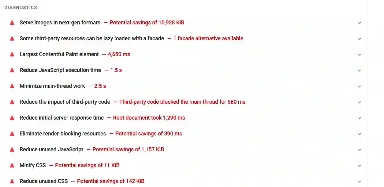
In retrospect, the biggest mistake I made was not optimizing the images; the site is extremely heavy. Probably, the number of images is too much, but additionally, they are all in JPG and full size; none of them were adapted for their function. This causes a very poor performance of the site. Here, I leave the Page Insights indicators for you to see:

If you are curious about the other mistakes made, here are all the red lights that pop up on the site (and yes, there is a long list of mistakes in the other colours):
With what I've learned so far about web development, I see so many points of improvement and considerations that should have been done, what make me itch to knock on the door to go back just to make all the corrections, but the reality is that it's time for a complete update and not fixes.
With what I've learned so far about web development, I see so many points of improvement and considerations that should have been done, what make me itch to knock on the door to go back just to make all the corrections, but the reality is that it's time for a complete update and not fixes.
What I keep
I am very fond of this site, many times I felt suffocated and overwhelmed for not understanding many things, but at the same time I had a lot of fun trying and making a lot of mistakes, but above all I appreciate the vote of confidence they gave me for just being tech-savy and curious. Thanks to this, I’m where I’m today.
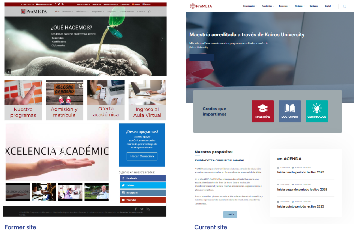
The site is still online today if you would like to visit it pro-meta.org and if you see any unforgivable errors that at all costs must be corrected, please write me immediately. To conclude, here is the version of the site before and the result.